Creating a home that feels beautiful, functional, and effortlessly organized doesn’t happen by accident. Whether you’re searching for interior inspiration, smart appliance guidance, or practical washing system maintenance tips, you’re likely looking for solutions that make everyday living easier and more enjoyable. This article is designed to give you exactly that—clear, experience-backed insights that help you elevate your space while keeping it pristine and efficient.
From optimizing layouts to understanding how color psychology in interior design influences mood and atmosphere, we focus on strategies that combine aesthetics with practicality. You’ll also find guidance on maintaining modern appliances and washing systems to extend their lifespan and improve performance.
Our content is built on expert research, industry best practices, and real-world home care knowledge—so you can feel confident that the advice you’re applying is both reliable and effective. Let’s transform your home into a space that truly supports the way you live.
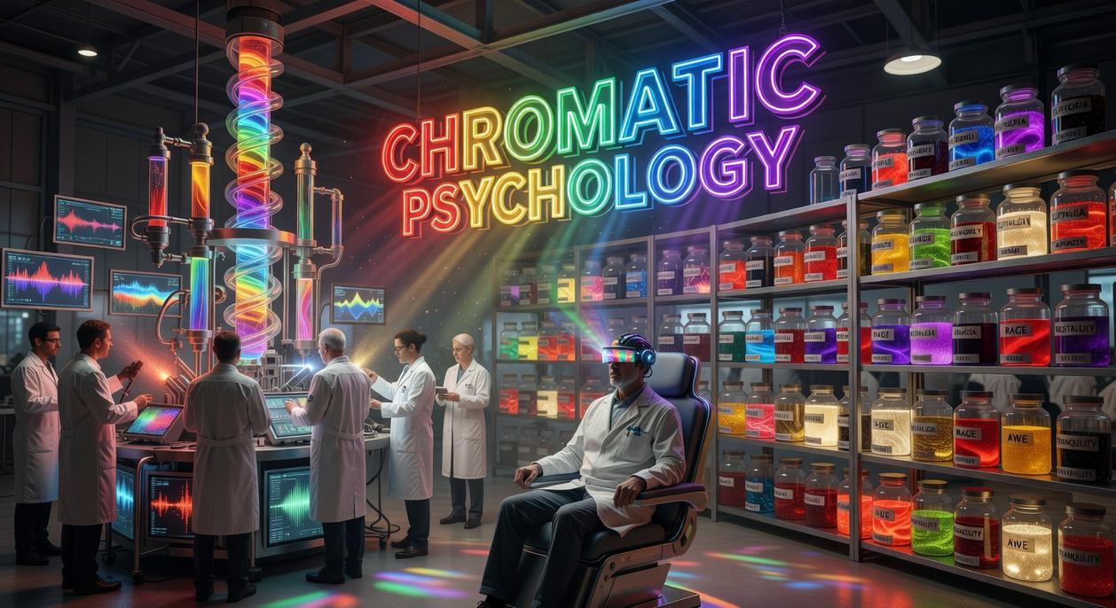
Overwhelmed by a wall of paint chips, you squint at identical whites and wonder why this feels so hard. Choosing color isn’t just aesthetic; it’s emotional architecture. Shades subtly raise heart rates, soften conversations, or sharpen focus. Yet most guides stop at trends.
The Mood Blueprint
This piece decodes how color choices shape behavior, using color psychology in interior design to engineer calm bedrooms or high-energy kitchens.
- Learn which undertones reduce stress in low-light spaces.
Some argue mood comes from furniture, not walls. But neuroscience shows hue influences perception within seconds (University of British Columbia). Color turns rooms into experiences.
The Science of Sight: Why Color Psychology Matters in Design
At its core, color psychology explains how our brains interpret different wavelengths of light and translate them into emotional and even physiological responses. For example, shorter blue wavelengths are often linked to calmness, while longer red wavelengths can raise energy levels and heart rate (Küller et al., 2009). However, not every reaction is universal. While many people find blue soothing, cultural associations differ—white symbolizes purity in some regions and mourning in others.
Early in my design experiments, I ignored color temperature—the difference between warm (reds, oranges) and cool (blues, greens) tones—and ended up with a living room that felt oddly sterile. Then I learned about saturation (intensity of a color) and value (its lightness or darkness). Highly saturated hues energize; low-value shades feel heavier.
In contrast, balanced combinations create harmony. Ultimately, understanding color psychology in interior design turns guesswork into intention (and saves you from repainting twice).
Energize and Inspire: Using Warm Tones to Create Vibrant Spaces
Have you ever walked into a room and instantly felt your mood shift? That’s no accident. Reds, oranges, and yellows don’t just “look nice” — they actively shape how a space feels.
First, consider red. It’s the color of passion, energy, and even appetite stimulation (there’s a reason so many restaurants use it). In dining rooms, red can spark conversation and encourage lingering meals. As an accent in living rooms, it adds drama and depth. However, would you really want that intensity in a bedroom? Too much red can feel restless, even overwhelming.
Next, think about orange. Warm yet playful, it signals enthusiasm and creativity. That’s why it works beautifully in home offices, kitchens, or workout spaces. Need a midday boost? A splash of orange might help you power through. It’s like a visual cup of coffee.
Then there’s yellow — the color of happiness and intellect. Perfect for kitchens or north-facing rooms, it reflects light and lifts spirits. Still, high-intensity yellows can cause visual fatigue over time. So moderation matters.
Ultimately, color psychology in interior design isn’t just theory; it’s practical magic. The question is: what kind of energy do you want your space to give back to you?
Create Calm and Focus: The Soothing Effect of Cool Hues
Cool hues are often praised in color psychology in interior design for their ability to slow the mind and steady the mood. In simple terms, these are colors that visually recede, making spaces feel open, airy, and restful (think of a clear sky stretching endlessly overhead).
-
Blues
First, blue is strongly associated with serenity, stability, and productivity. Studies suggest blue environments can lower heart rate and promote concentration (Küller et al., Color Research & Application, 2009). That’s why bedrooms, bathrooms, and offices benefit most. A soft powder blue encourages sleep, while a muted navy can sharpen focus during work hours. (Ever notice how many tech brands lean blue?) -
Greens
Next, green connects us to nature, balance, and tranquility. Because the human eye processes green efficiently, it’s often called the most restful color to see. Living rooms and bedrooms painted sage or olive feel grounded and welcoming. Pro tip: Pair green with natural textures like linen or wood for extra calm. -
Purples
Finally, purple blends luxury with creativity. Light lavender soothes bedrooms, while deep plum adds drama to dining rooms or studios. Used thoughtfully, it feels inspired—not overpowering.
Of course, some argue cool hues feel cold. However, balanced lighting and avoiding common furniture placement mistakes to avoid in modern homes (https://livpristwash.com/furniture-placement-mistakes-to-avoid-in-modern-homes/) ensure these shades feel inviting, not distant.
The Unsung Heroes: Mastering Neutrals for Balance and Sophistication
Neutrals are the stage crew of a beautiful room—rarely center stage, yet everything falls apart without them.
Grays act like a tailored blazer: sharp, adaptable, and effortlessly refined. A cool gray (with blue undertones) feels crisp and modern, like a city skyline at dawn. A warm gray (with beige or brown undertones) softens the mood, wrapping a space in quiet comfort. Both let bold accents shine without competition.
Whites are spatial magicians. They reflect light, making rooms feel larger and cleaner. But without texture—think woven throws, matte ceramics, natural wood—they can feel clinical (like a hospital waiting room). Texture is the heartbeat that keeps white alive.
Beiges and browns ground a room the way roots anchor a tree. Earthy and steady, they foster calm through color psychology in interior design. The result? Spaces that feel welcoming, balanced, and beautifully composed.
From theory to practice, the 60-30-10 rule offers a foolproof way to balance any room. In short, you dedicate 60% to a dominant color, 30% to a secondary shade, and 10% to a bold accent. For example, picture a living room with light gray walls covering most surfaces, a navy sofa grounding the space, and yellow pillows adding energy. This structure simplifies color psychology in interior design, ensuring harmony without guesswork. However, always test paint swatches on your actual walls; natural and artificial light shift undertones dramatically throughout the day, affecting mood and comfort. In turn, you gain confident results.
By now, your search to understand the impact of color has a clear direction. The real challenge, however, is the uncertainty of choosing shades that not only look good but also feel right. Research from the University of Texas found that blue environments boosted calm and productivity, while red increased physiological arousal, showing how deeply color shapes experience. That’s why color psychology in interior design works: start with the emotion you want, then choose hues that support it. In other words, mood first, paint second. So, before you reach for a swatch, pick one room and define its desired atmosphere.
Create a Home That Finally Feels Right
You came here looking for practical ways to elevate your space, simplify upkeep, and make smarter design choices. Now you understand how layout, lighting, smart appliances, and especially color psychology in interior design work together to shape the way your home looks and feels.
An uninspired or chaotic space can quietly drain your energy every single day. The right colors, efficient systems, and intentional design choices don’t just improve appearance — they restore comfort, clarity, and control in your home.
Now it’s time to take action. Start by choosing one room to refresh this week. Apply what you’ve learned, fine-tune your washing systems, and make one color adjustment that supports the mood you want to create.
If you’re ready for a cleaner, smarter, more beautifully balanced home, explore our expert guides and maintenance tips today. Thousands of homeowners rely on our insights to keep their spaces pristine and stress-free — and you can too. Start transforming your home now.
 Head of Content & Home Living Specialist
James Christopherainenzo writes the kind of home living highlights content that people actually send to each other. Not because it's flashy or controversial, but because it's the sort of thing where you read it and immediately think of three people who need to see it. James has a talent for identifying the questions that a lot of people have but haven't quite figured out how to articulate yet — and then answering them properly.
They covers a lot of ground: Home Living Highlights, Smart Appliances and Clean Living, Pristine Home Care Techniques, and plenty of adjacent territory that doesn't always get treated with the same seriousness. The consistency across all of it is a certain kind of respect for the reader. James doesn't assume people are stupid, and they doesn't assume they know everything either. They writes for someone who is genuinely trying to figure something out — because that's usually who's actually reading. That assumption shapes everything from how they structures an explanation to how much background they includes before getting to the point.
Beyond the practical stuff, there's something in James's writing that reflects a real investment in the subject — not performed enthusiasm, but the kind of sustained interest that produces insight over time. They has been paying attention to home living highlights long enough that they notices things a more casual observer would miss. That depth shows up in the work in ways that are hard to fake.
Head of Content & Home Living Specialist
James Christopherainenzo writes the kind of home living highlights content that people actually send to each other. Not because it's flashy or controversial, but because it's the sort of thing where you read it and immediately think of three people who need to see it. James has a talent for identifying the questions that a lot of people have but haven't quite figured out how to articulate yet — and then answering them properly.
They covers a lot of ground: Home Living Highlights, Smart Appliances and Clean Living, Pristine Home Care Techniques, and plenty of adjacent territory that doesn't always get treated with the same seriousness. The consistency across all of it is a certain kind of respect for the reader. James doesn't assume people are stupid, and they doesn't assume they know everything either. They writes for someone who is genuinely trying to figure something out — because that's usually who's actually reading. That assumption shapes everything from how they structures an explanation to how much background they includes before getting to the point.
Beyond the practical stuff, there's something in James's writing that reflects a real investment in the subject — not performed enthusiasm, but the kind of sustained interest that produces insight over time. They has been paying attention to home living highlights long enough that they notices things a more casual observer would miss. That depth shows up in the work in ways that are hard to fake.